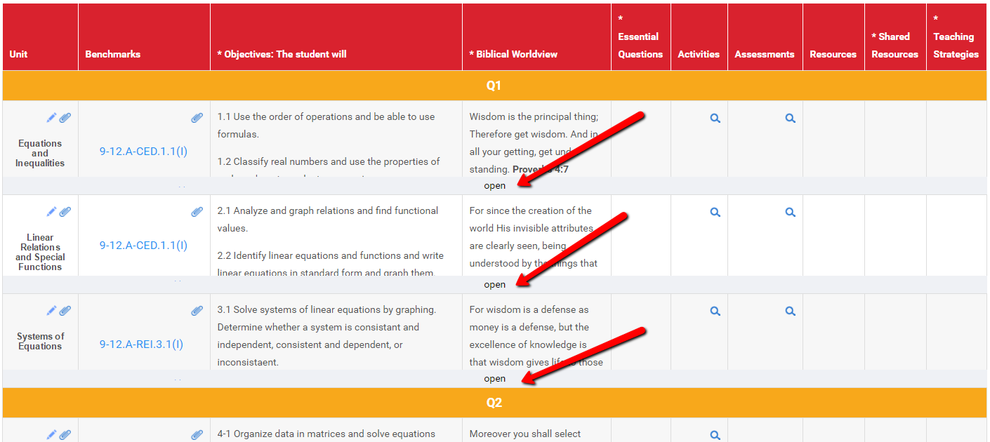
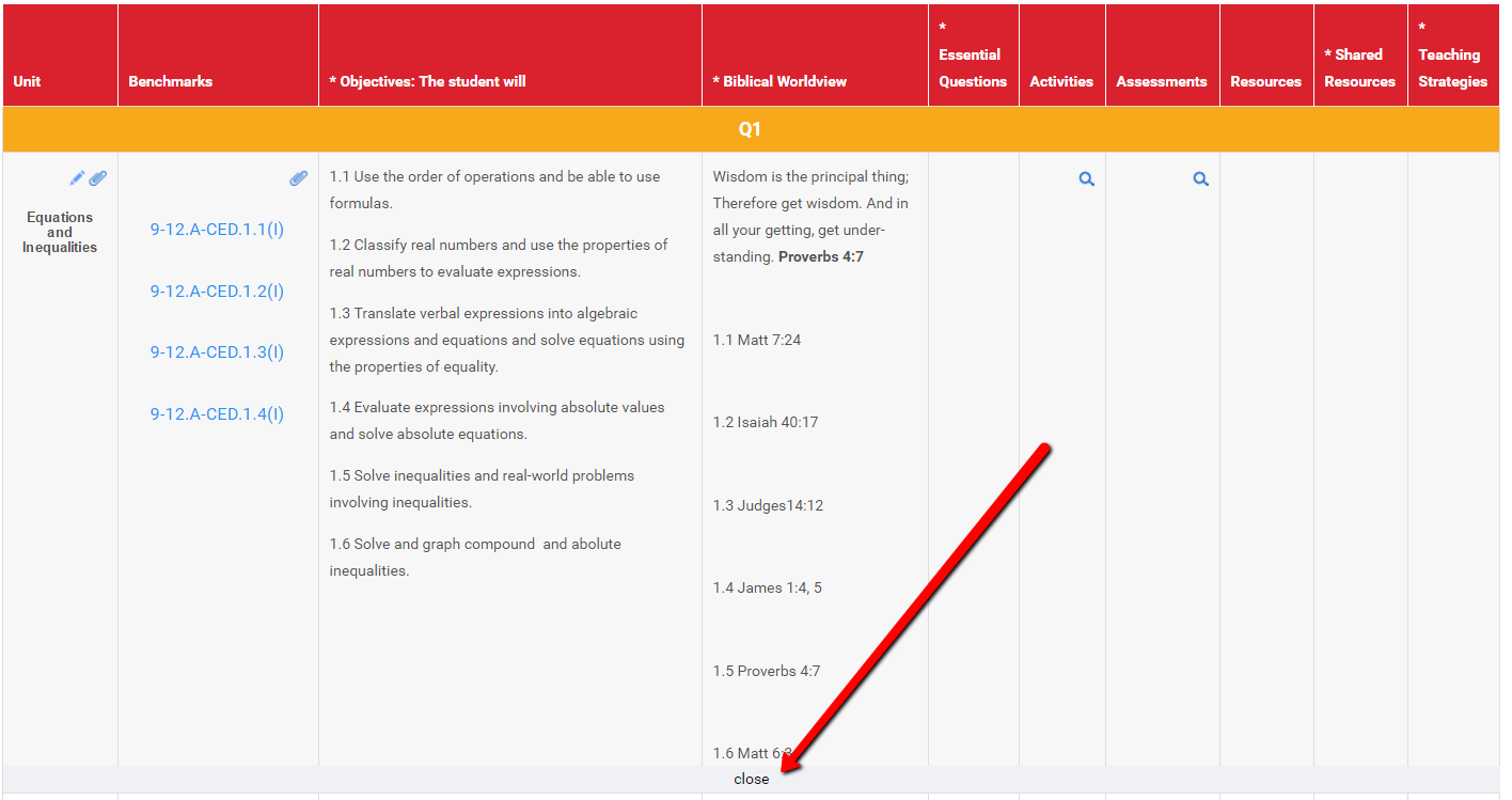
One of the exciting changes coming to the new version of Curriculum Trak is an improved way to view curriculum maps. This feature collapses each unit within a map to a consistent number of lines by default. This allows for a quick review of the main content in a map and which fields have content in them. If the person reviewing the map desires to see more detail within any unit, a simple click will expand that unit to reveal all of the content it contains.
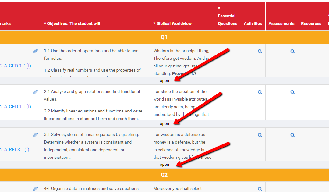
Below is an image of the updated map view. Notice the “open” button.

In the image below, you can see the expanded map. Notice the “Close” button.

This is just one example of some of the enhancements to Curriculum Trak 2.0 that will make it more useful. We are excited for you to see some of the others in the near future.


