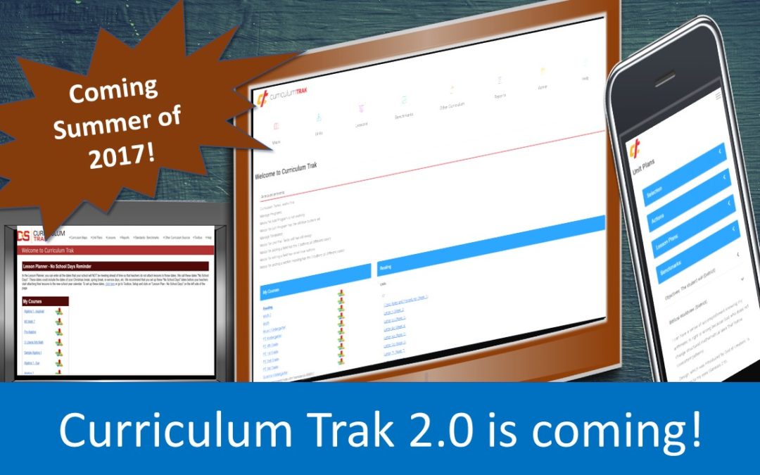
Changes are coming to Curriculum Trak this summer! The initial design work of the new look and feel has been completed, and we think you will love the changes. All of the updates are focused on allowing users to be more efficient in their use of the mapping program they already know and love. All of the features you appreciate will still be part of Curriculum Trak 2.0, but the user interface will incorporate the latest practices and styles of web design. One of the major differences in the look is that each area of Curriculum Trak will have its own color scheme. This will allow users to know exactly where they are within the program at a quick glance.
Curriculum Trak 2.0 includes much more than just cosmetic changes. Behind the updated fonts and colors is a more responsive design to improve Curriculum Trak usefulness no matter the screen size. We are intentionally seeking to support busy teachers who may need to reference and even edit their maps and lesson plans on the go. When you transition to the new version of Curriculum Trak, you will be able to perform some of the basic Curriculum Trak functions just as easily on your smartphone as you currently can on your desktop computer.
We can hardly wait to roll this out to all of our Curriculum Trak schools, but there is still quite a bit more work to do in this exciting process. An official release date has not yet been determined for this summer, but we have every intention to keep you informed as the transition comes closer. In the meantime, check back often for additional details. Contact support if you have any questions or concerns.
Beta Testing: If you would like your school to participate in beta testing of the new Curriculum Trak version, please contact support. We would love to have you participate!


